Reflections on Life through poetry, essays and photos
IMG_3244
1 thought on “IMG_3244”
Anonymous
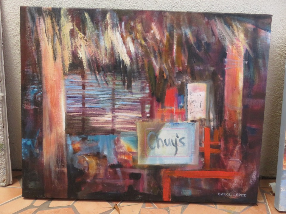
I’ve changed this one up a little – am intrigued by how restaurants here use bright hits of neon coloured paper for their casual signs, and how those gaudy colors seem to complement the natural hues of palapa, untreated wood, raw ceramic clay, etc. Think I will bring some really bright paint colors with me next fall – Opera by Holbein is a good shocking pink; now I need some shocking lime, turquoise, bubble gum pink. With a little patience and some focus, I could mix these colors myself, I’m sure. In any case, I feel very grateful to have such a variety of good materials. Just want to use them up.

I’ve changed this one up a little – am intrigued by how restaurants here use bright hits of neon coloured paper for their casual signs, and how those gaudy colors seem to complement the natural hues of palapa, untreated wood, raw ceramic clay, etc. Think I will bring some really bright paint colors with me next fall – Opera by Holbein is a good shocking pink; now I need some shocking lime, turquoise, bubble gum pink. With a little patience and some focus, I could mix these colors myself, I’m sure. In any case, I feel very grateful to have such a variety of good materials. Just want to use them up.
LikeLike