Moving Focal Point: Cee’s Rule of Thirds


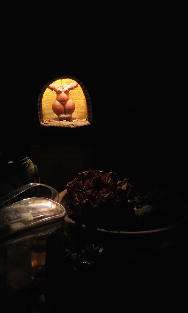 I’m trying to figure out why the rule of thirds doesn’t seem to work in this photo. I think it is because most of the elements are lined up to the left. If the bottom elements extended over to the right margin, I think this would work better. Below is the original., which I prefer. Which do you prefer?
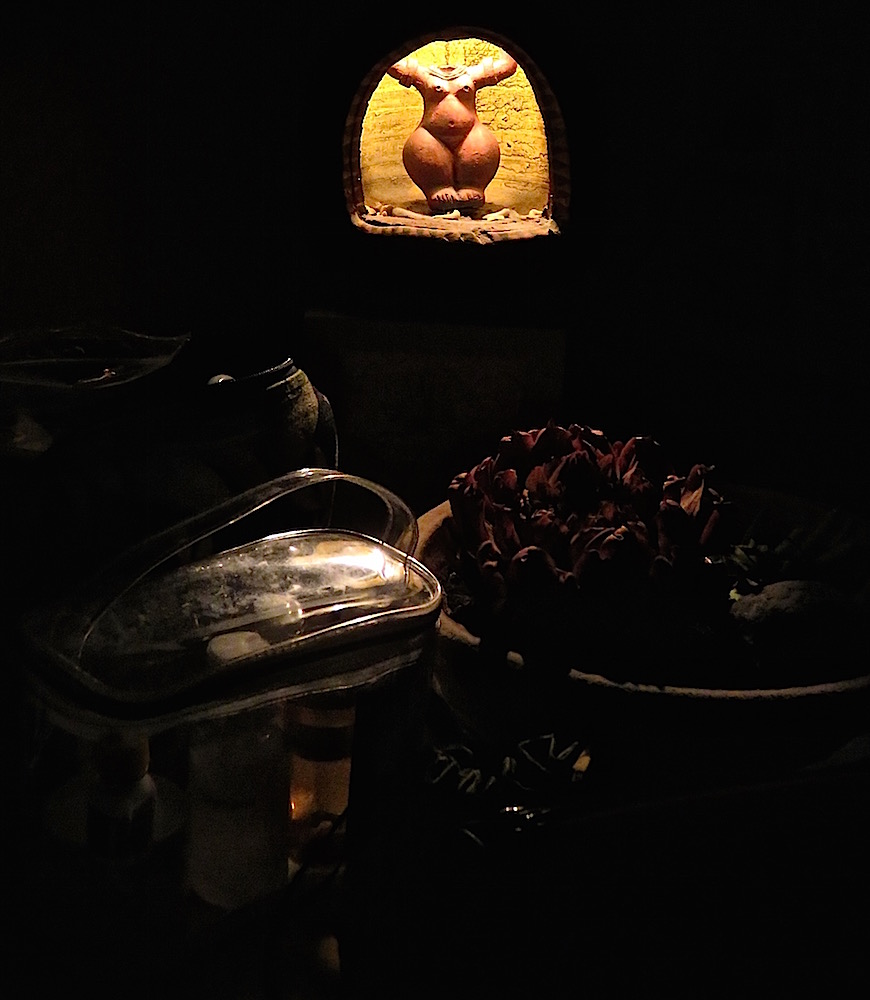
 In this photo, cropped from the larger photo below, I followed Cee ‘s rule which says, “. . . divide your view finder into a gird with nine boxes . . . . you should place the subject of your picture on one of the points where the lines intersect.” I much prefer the version above, where the larger “belly button” it placed over the upper left intersection line to the busier original version below.


I also prefer the bottom photo, because of the placement of the items on the table in the forefront, and the lighted figure which is the focal point here…and the effect of the light on the other items. In the top there is this darkness in the right third of the pic, which made me look to see what else might be there. Having ventured those comments, I hasten to add that I am not an art or photo expert by any means–but I do instinctively know what I like . 🙂
LikeLike
I like the dark photo with alcove. Your second one is best. Yes the alcove is in the middle, but in the upper third. That is why it works.
LikeLike
I agree…I tried moving the woman element, but found you have to take other elements into account as well.
LikeLike
Also, some photos want to be centered. This isn’t a rigid unbreakable “go to jail, do not pass go” rule. It’s a guildline. I think you’ll find most of your pictures fall naturally into it.
LikeLike
guideline. Oof.
LikeLike