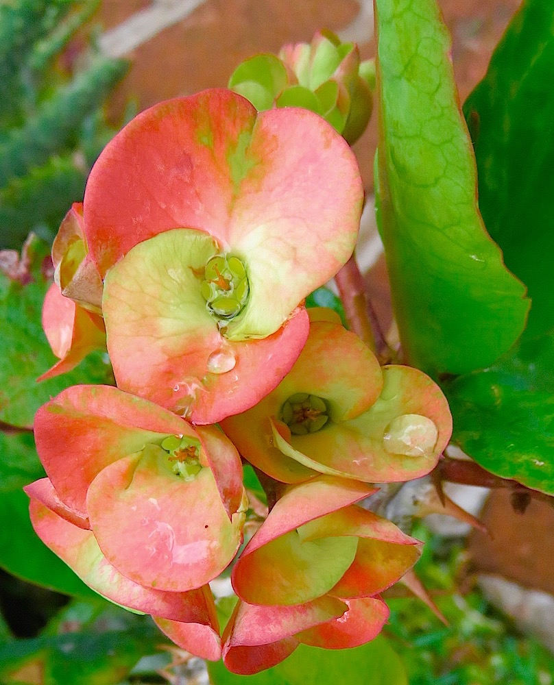
Diagonal Lines
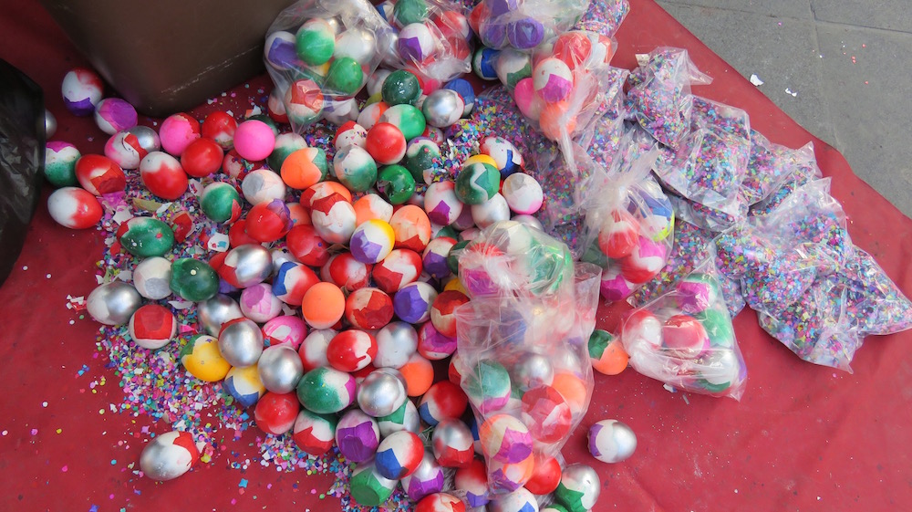
Okay, I’m going to invite you over for a playdate. After everyone left on Thanksgiving evening, as I was cleaning up/clearing up, I got to looking on the diagonal, thanks to Cee. I snapped a few pictures of what was available and then later started nudging and seeing what happened. Want to come along to see what I discovered?
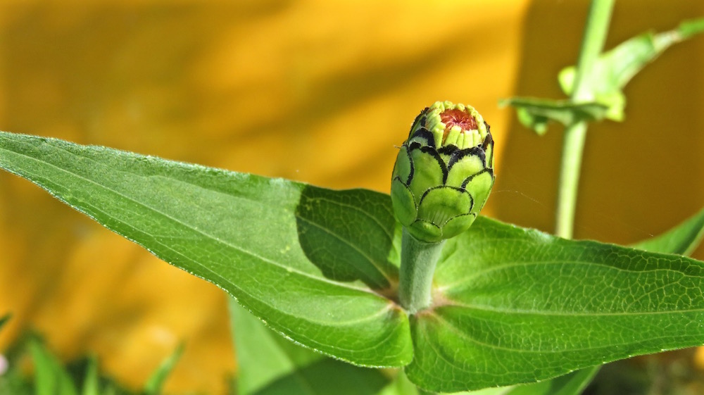
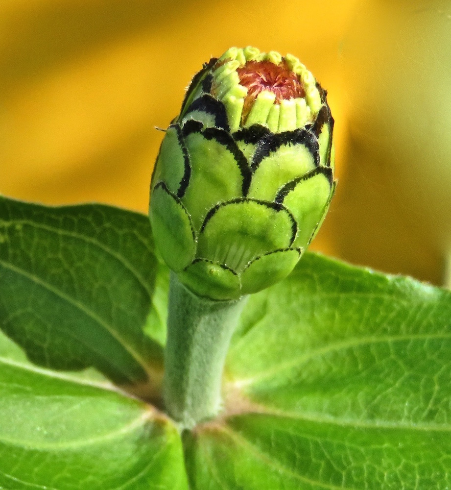
 I quickly found out that almost everything is more interesting and artistic if there is a diagonal slant to it. Intuitively, I think this is usually how I set up my shots.
 In shots where there wasn’t a distinctive enough diagonal element, I started just spinning the picture a bit, but I quickly spotted a problem.

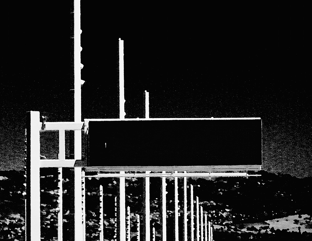
 As I did this, any vertical elements started to look as though they were about to topple over!
  A solution was to just crop to get rid of that vertical element.
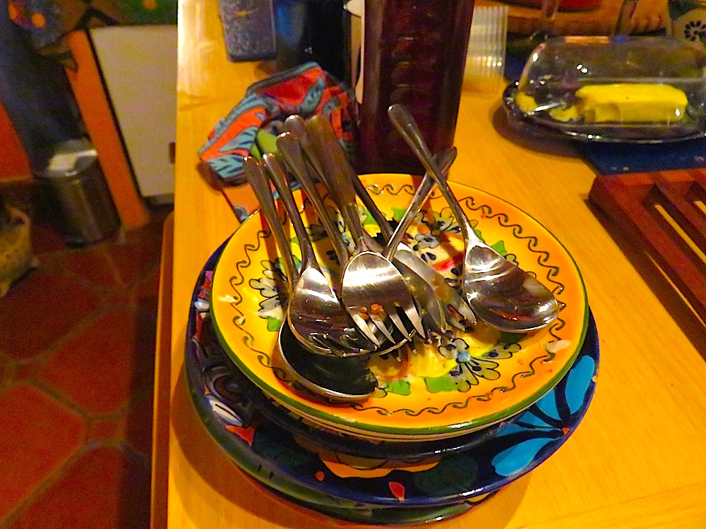
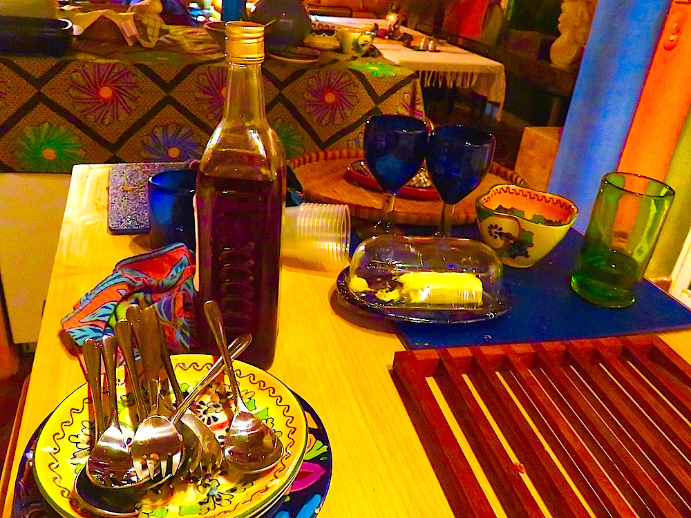
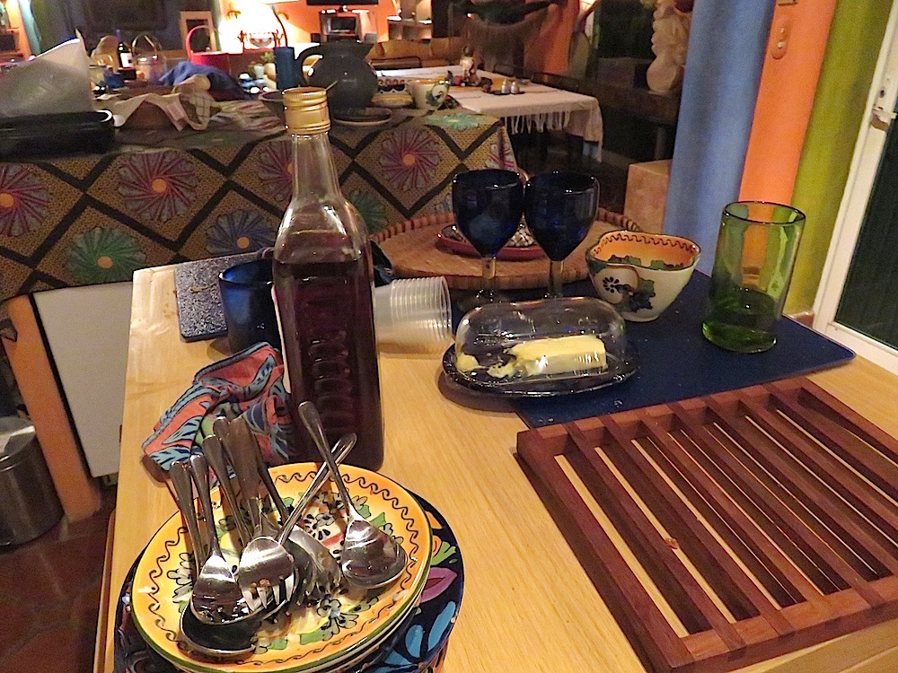
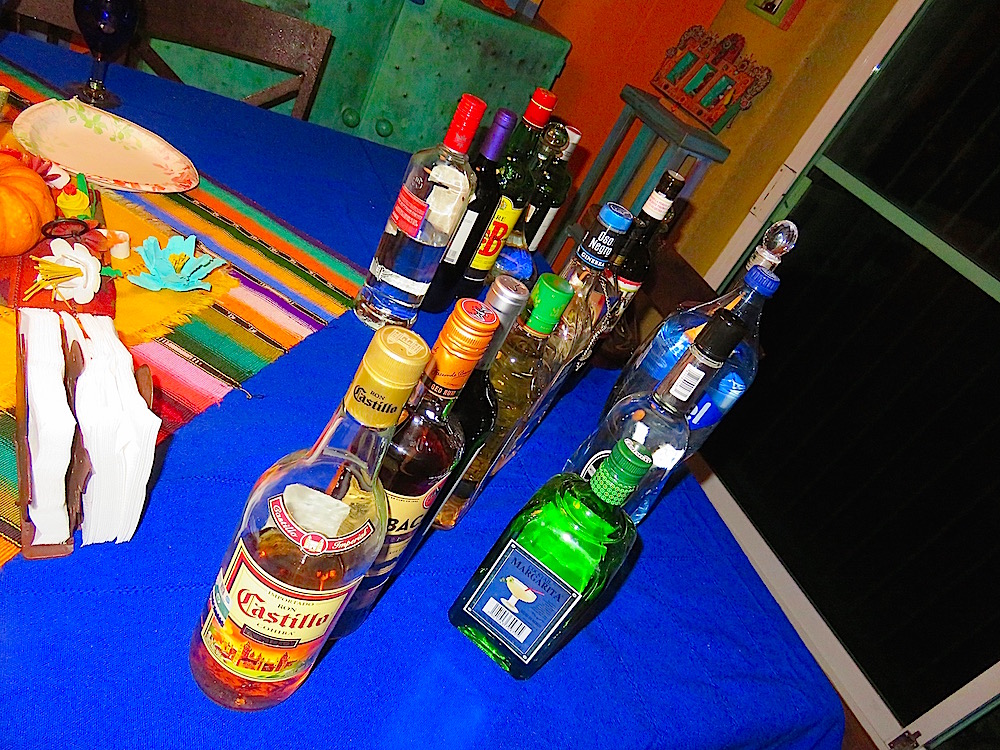
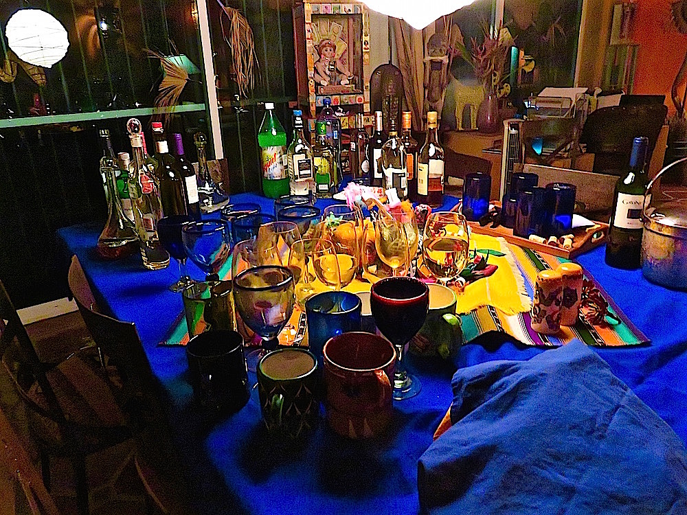
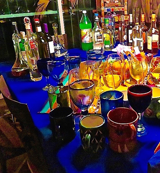
I then decided to try to set up some vertical shots. I lined up the liquor bottles I’d brought in from the bar set up on the terrace, but you can see how poorly that turned out in this shot: Yech! Just too terrible. Too contrived. Makes my teeth itch!!!!
 And this one is even worse!!! Cancel this image in your mind!!!!
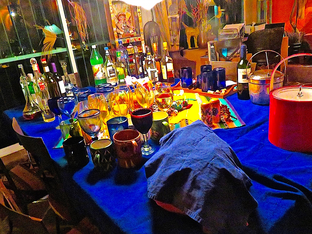
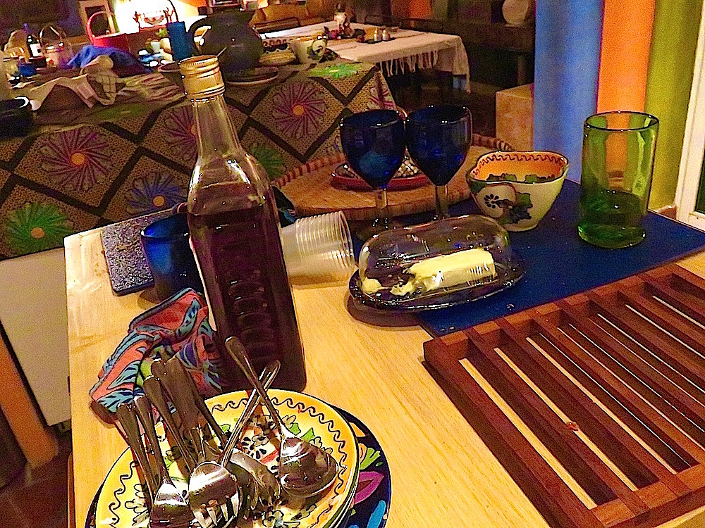
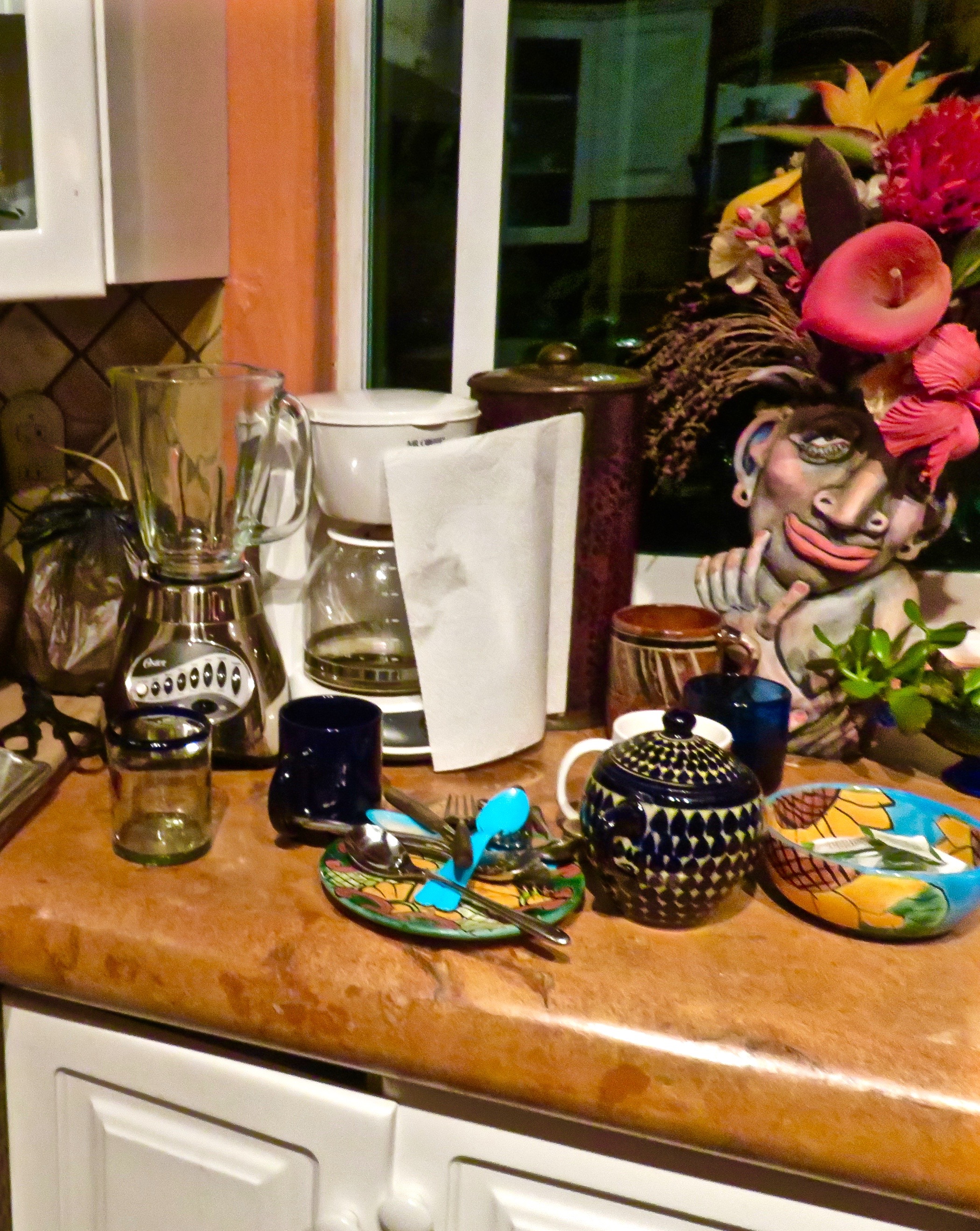
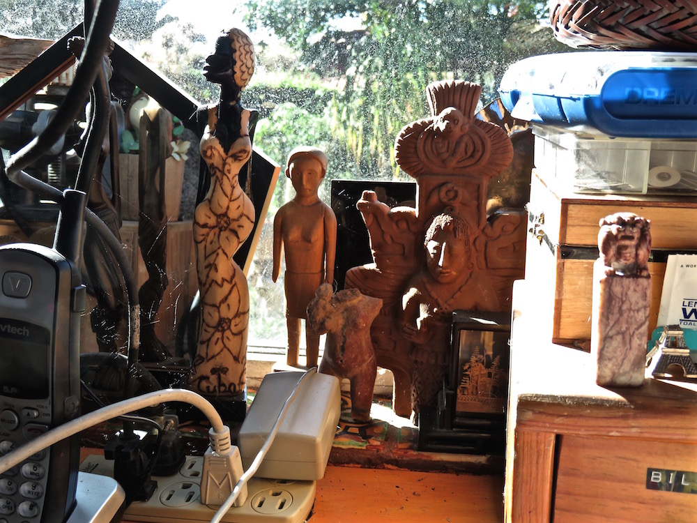
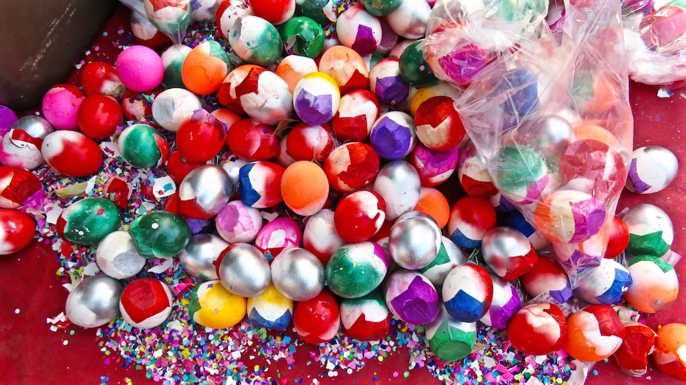
 The original was better. The table edge accounted for the diagonal and there were some natural if somewhat haphazard other diagonal lines, but about that ugly pile of used napkins, not to mention the fuzzy ghostlike area over the desk to the back right. I think it was caused by smoke from the candle.
 Sharpening and brightening and boosting the color still didn’t help that unsightly item to the front of the picture, so––
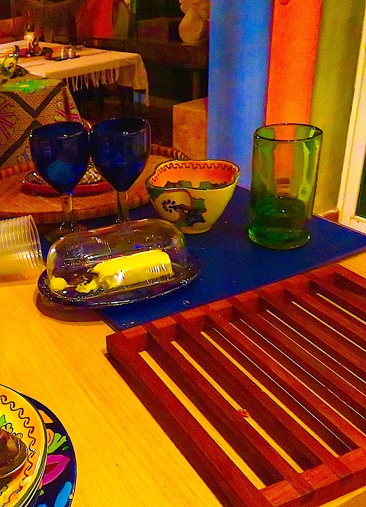
 I cropped a bit more. Better, but still no cigar.
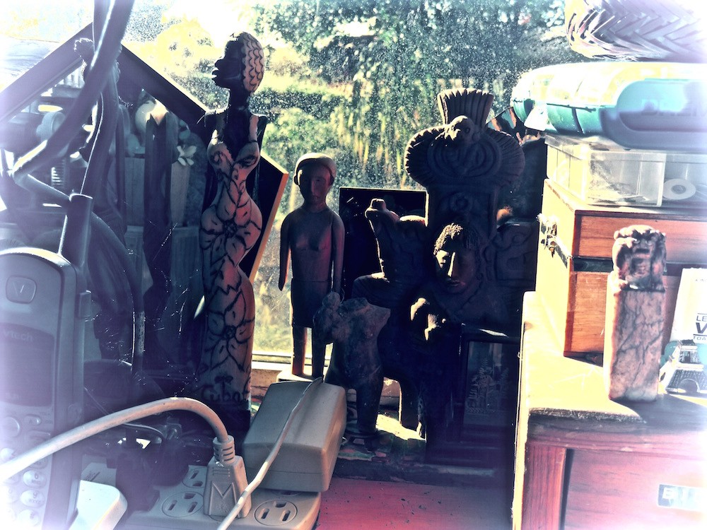
 Then I started to get silly, using my very limited cloning tool to cover up the lump of napkins and give the illusion of a bigger crowd or at the very least a thirstier one. An interesting effect, but waaay too much going on in the picture!
 So, once again, cropping to the rescue.
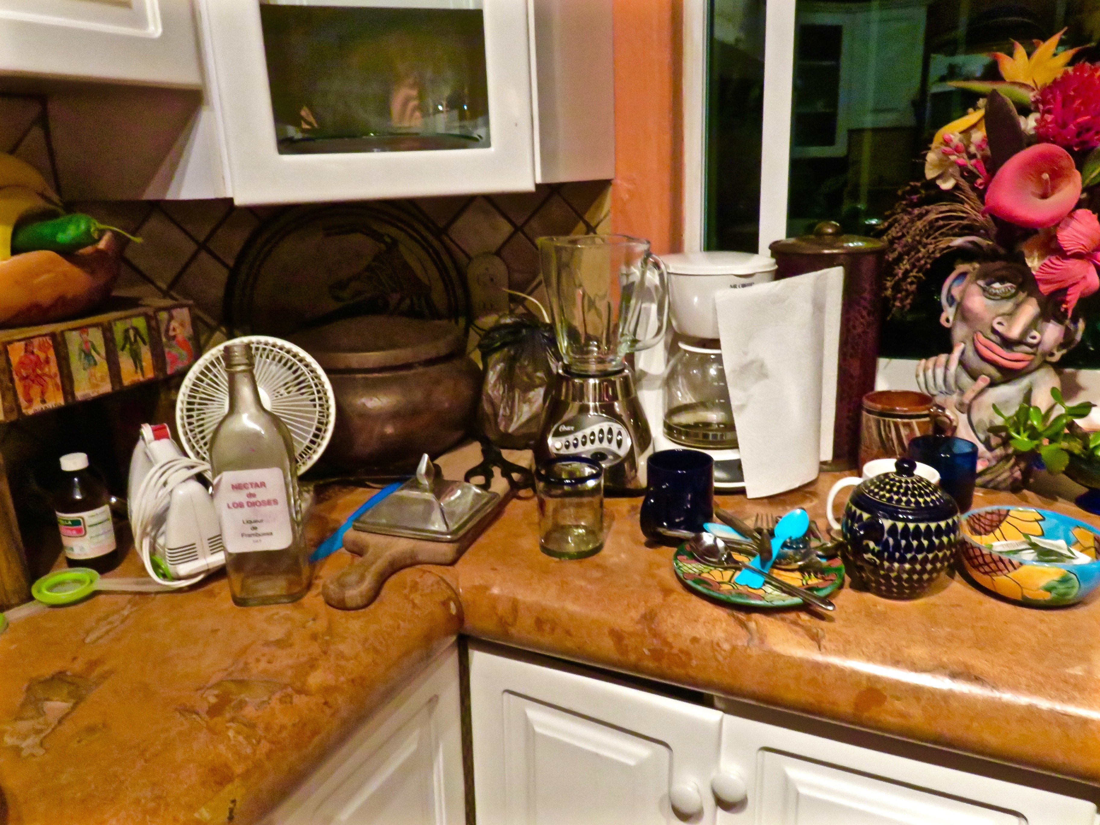
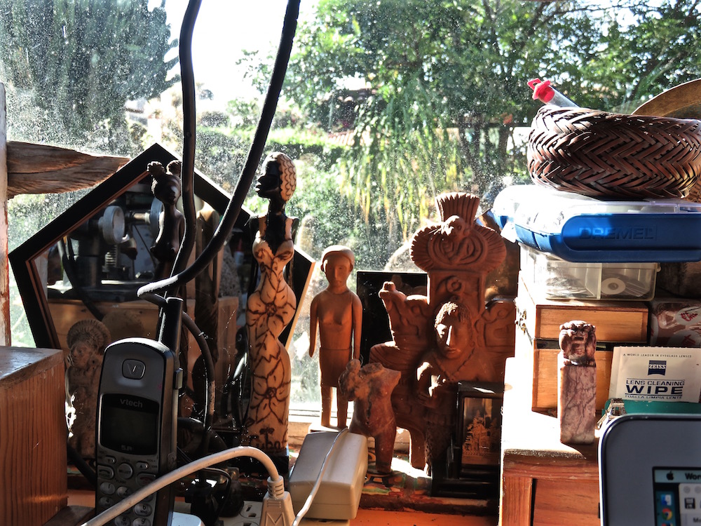
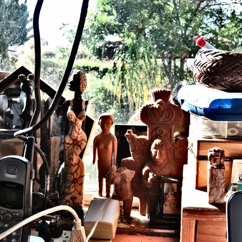
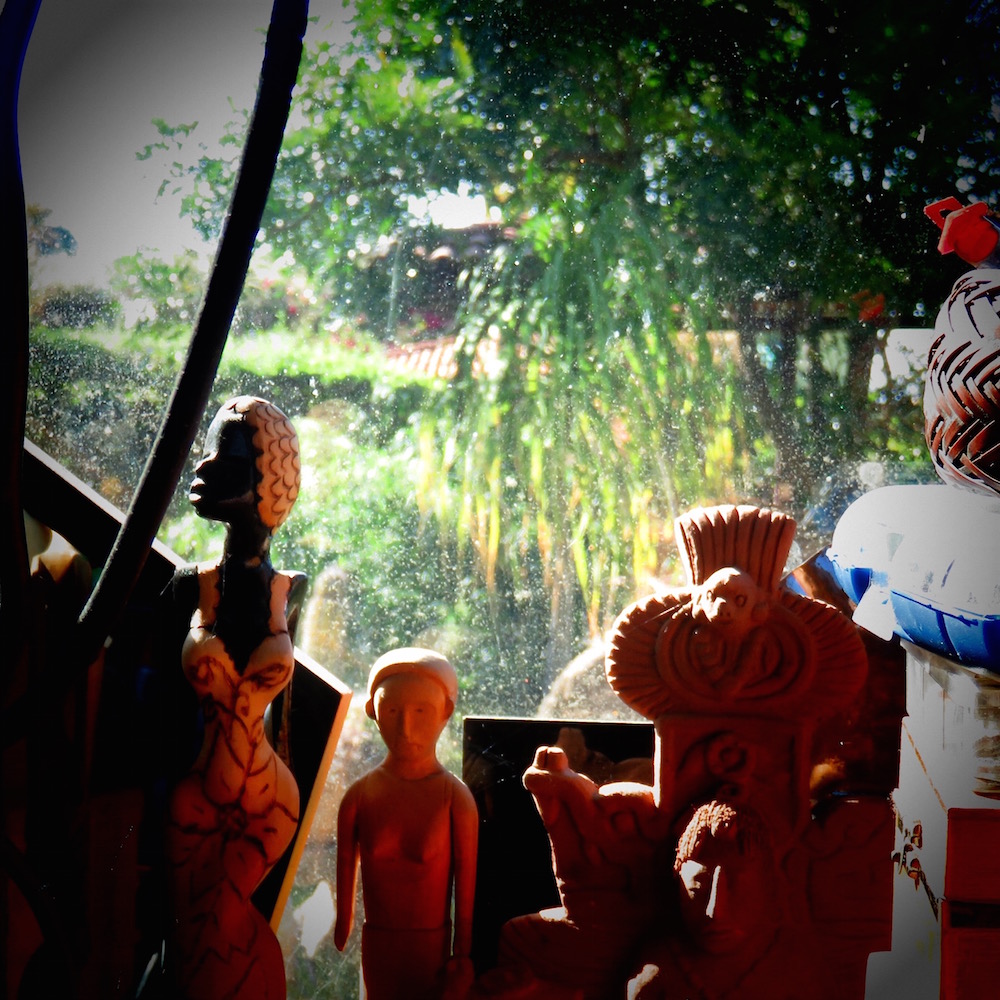
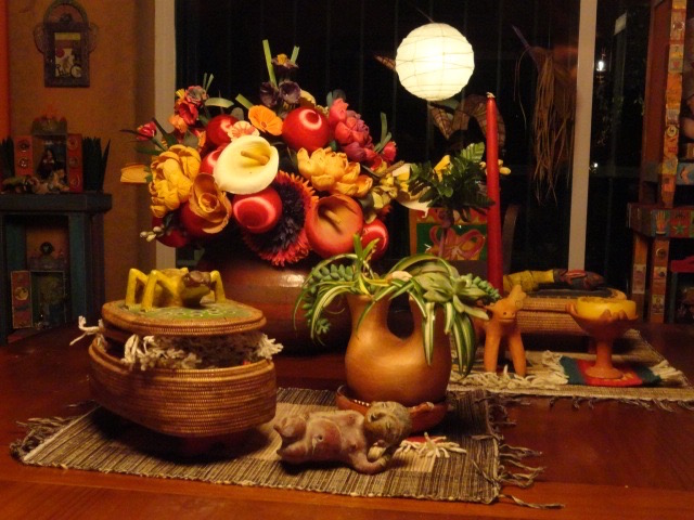
 This wonderful sculptural vase made by my friend Julie Mackie seems to be getting a good deal of pleasure out of all my nudging and clicking. Julie was my sidekick when I set up shows at the art center in CA, so I can imagine her getting a kick out of my late night adventures in placement.
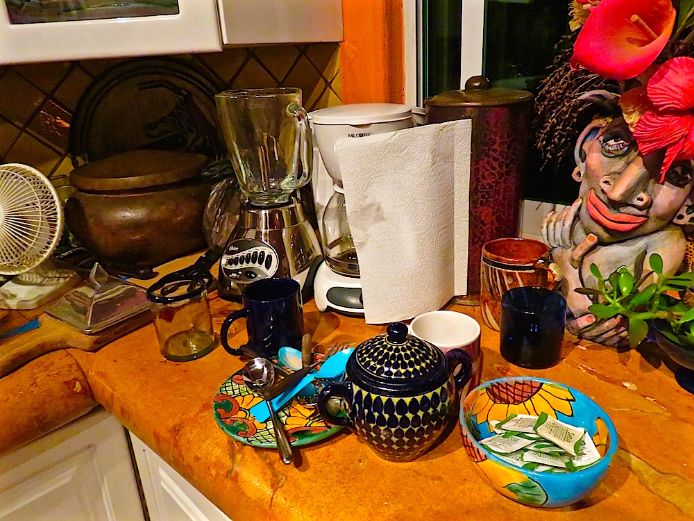
  I think we need another angle on Julie’s wonderful piece as well. But, as you can see, nudgin’ ain’t gettin’ the dishes done!!! Better angle on the picture though, don’t you think?
 And look at how nice and straight that bottle is. And a diagonal to boot!
  And–more Julie guy, slightly out of focus. He looks a bit drunk, or sleepy, as I am. I also need a swim before I sleep so I guess the photo shoot is over! If you didn’t learn anything, I hope at least you were amused. If not amused, then what are you still doing here? I’m off to the night pool–crickets and frogs call. Happy Diagonal!!!
http://ceenphotography.com/2015/11/25/cees-compose-yourself-photo-challenge-week-8-diagonal-lines/


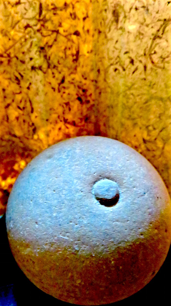
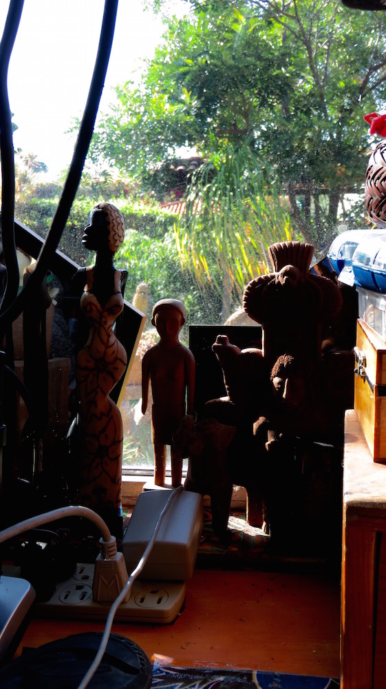
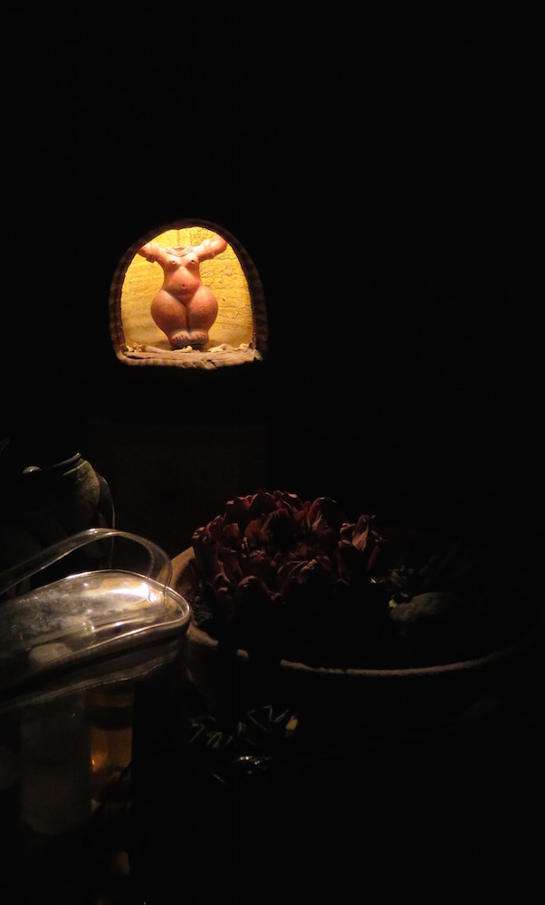 I’m trying to figure out why the rule of thirds doesn’t seem to work in this photo. I think it is because most of the elements are lined up to the left. If the bottom elements extended over to the right margin, I think this would work better. Below is the original., which I prefer. Which do you prefer?
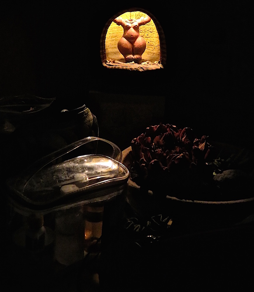
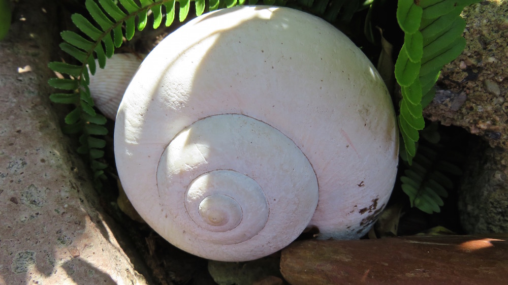
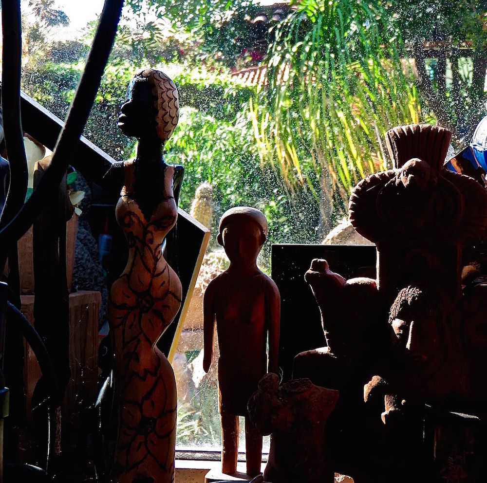
 In this photo, cropped from the larger photo below, I followed Cee ‘s rule which says, “. . . divide your view finder into a gird with nine boxes . . . . you should place the subject of your picture on one of the points where the lines intersect.” I much prefer the version above, where the larger “belly button” it placed over the upper left intersection line to the busier original version below.